3 Magic Tools Designers Use to Make a Fabulous Room
Most clients come to me because they don’t know how to decorate a room in which everything looks fabulous together. They know what they like when they see it, but they’re mystified by finding and coordinating specific pieces that result in a cohesive design.
On the blog this time, I’ve got a short-cut that solves this mystery. My furniture collections make it easy to see the entire style concept for one room (in this case, a welcoming front hall) because I’ve happily done all of the coordinating for you. It’s my jam, and it’s one of the things I love about my work.
Designers of all sorts (interior, graphic, product, car, etc.) have a toolbox full of elements that we use when we create things. Today I’m pointing out three elements in this front hall to show you why each piece matters within the whole style concept.
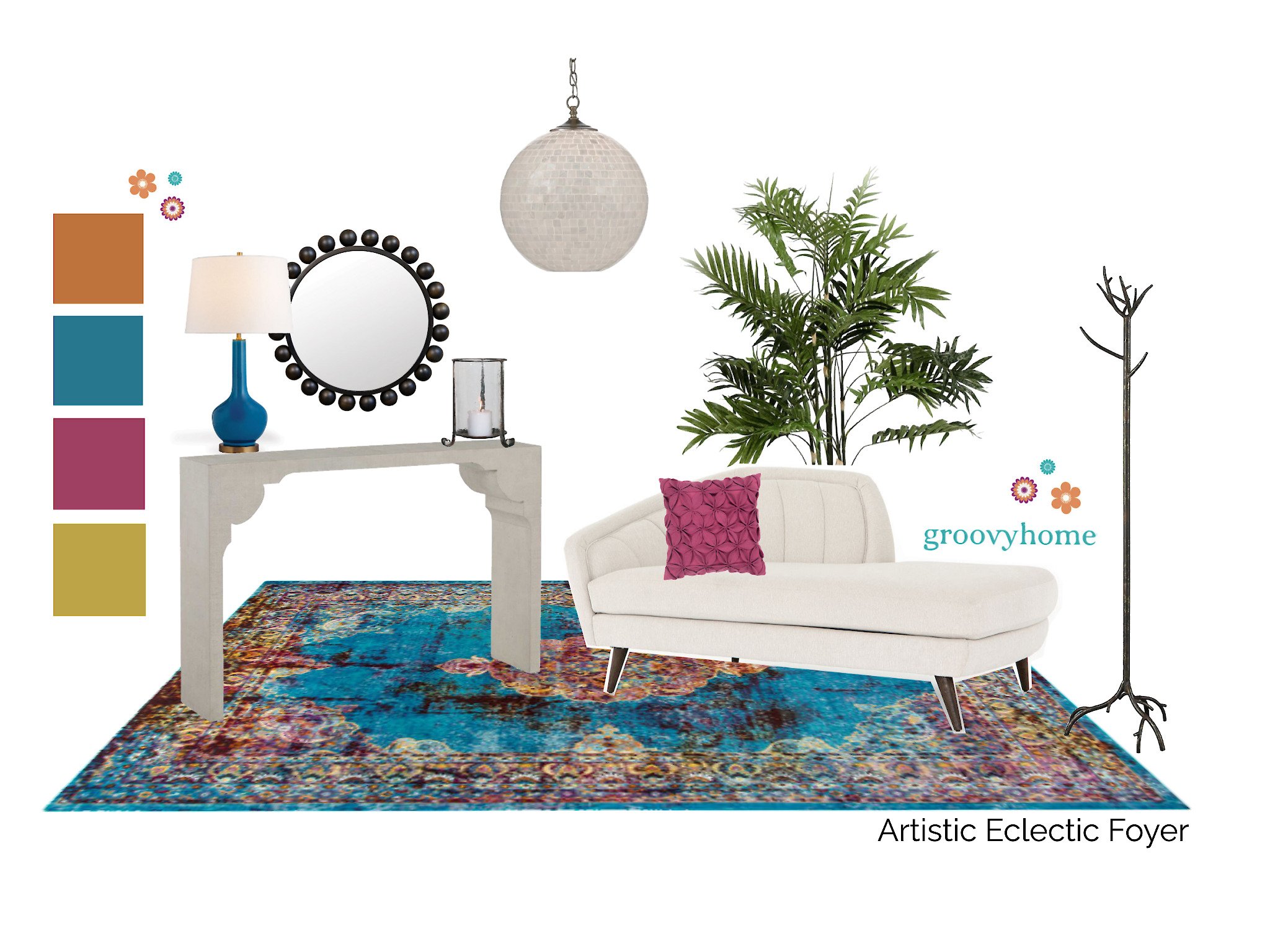
Let’s look at a collection I call Artistic Eclectic.
It’s Eclectic Style because there’s a variety of influences mixed together; I see Traditional, Boho, Modern, Art Deco and some Eastern elements. This collection is also very true to my personal design style. Hey, I can’t help being a 70’s girl, and a little Boho vibe in bold colors will always have a place in my heart!
Line Creates a Connection
The Line of something mostly means the outline of that thing, as if you were to draw it. Lines can also show up as part of something else, like in a picture.
Looking at the rug in this collection, you can see lots of curved lines in the design. You can also see straight lines around the borders, and the rectangular shape of the rug itself is a straight line too.
The table has a combination of curved and straight lines, and so does the chaise. Are you sensing a theme here? I’m creating a connection between these objects with Line. Their combo of straight and curved lines is a common factor among them, so they relate to each other visually. That’s one reason why they look good together.
Pattern Plays a Starring Role
Pattern is quite often printed onto something like wallpaper or tiles. Pattern is woven into fabrics or carved into wood or stone. It’s also in the repetition of shapes or lines, like on a building or a piece of furniture.
This rug has a strong decorative pattern on its entire surface. Clearly it’s the boldest one in the group. As for the other pieces, you can see that the mirror frame is a pattern of circles, the chaise back is a pattern of graduating lines, and the mosaic light fixture is a subtle pattern of squares.
Why do so many patterns relate to each other and not compete? Because the rug is the star and the other pieces play supporting roles. That’s one reason why they live in harmony.
Texture Brings the Right Touch
Texture is a visual and a tactile element. Basketry, caning or wicker, knitted throws or pillows all look really interesting and beckon us to reach out and touch them. You can get texture in the nap of a rug or from the leaves on a plant. Walls sometimes have a plaster-y look to them, and the dreaded popcorn ceiling? That’s texture in a bad way.
It looks like this rug has a decent nap, like it’s thick and soft and inviting. The plant gives a lot of texture and repetition with its pointy leaves and negative spaces. See how the coat rack relates to the plant and brings in more natural texture? The light fixture is a whole world of texture and reflection, and even the pillow gets its own 3-D fabric flowers.
The rest of the design is relatively smooth and restful. That’s why all of the texture works here; I balanced it with other elements that shine in different ways.
Line, Pattern and Texture
I love using these design elements, along with many others. A big part of my job is to achieve visual balance and harmony in the spaces I design. And thankfully I have access to all the tools that let me do it.
If you want to get the vibes of my other furniture collections, browse my Shop page.
Or…take my Color Mixer Quiz!
This free quiz will give you a palette of 7 colors that you can use for any decorating project. Mix and match as you please because I’ve curated these colors to look great together in so many ways: on walls, furniture, rugs or curtains. You’ll also get a front hall concept board that’s shop-able, and extra color info in three follow-up emails.
BTW, the Artistic Eclectic collection is one of the quiz results! Will it be yours?
Until Next Time,
Nan
About Nan
I’m an interior designer who helps people turn their homes into their sanctuaries without the pain of renovating. I’ve been working as a professional designer since 1995 and one thing I love about interior design is how it can evoke a mood and create whatever feeling you want in your space. In that way, it’s kind of magical.
Does your Layout support your Lifestyle?
Get the free guide.


